Listeners:
Top listeners:
The Breeze Radio The Breeze Radio
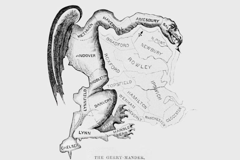
A reader’s guide to understanding crime data and the politicians who cite it.
Crime is up! Crime is down!
These might be powerful political messages. But they’re also largely meaningless.
Why? Because they lack a baseline – up compared to? Down compared to? Last week? Last year? The all-time high? The all-time low?
I’m not going to weigh in (much) here on President Donald Trump’s plans to federalize Washington, D.C., law enforcement for supposedly being one of the world’s “most dangerous cities.” But I do want to flag for you, the reader, some of the pitfalls I have come to know from writing about crime in a political context for decades.
You may be familiar with the old line “There are three kinds of lies: lies, damned lies and statistics,” which is thought to have been popularized in the United States by Mark Twain.
That’s where the “baseline” issue I flagged comes in. Unless someone gives you the “compared to what” for their crime-is-up/crime-is-down claim, their claim is entirely pointless.
One of my favorite resources for crime data is the Real Time Crime Index, run by the respected independent data analysis guru Jeff Asher. Unlike many other analyses, RTCI doesn’t rely only on FBI figures and instead taps into data from hundreds of law-enforcement agencies nationwide.
Click through to the site. You’ll notice the disclaimer urging users to be wary of comparing between cities or counties because of disparate sources of data.
But that doesn’t mean you can’t use the module to compare, say, Washington, D.C.’s violent crimes from January to May 2024 to those from January to May 2025. Violent crimes, using that baseline, are down 22.4%. Use the same parameters for nationwide data, you get a 10.9% drop.
But if you look at murders nationwide using a 12-month sum, meaning the total murders over the previous 12 months, and compare May 2025 (total murders: 7,551) to December 2019 (7,766), that reveals a minimal decrease of 2.8%.
Baselines matter.
Which gets us to another quirk of crime statistics: raw number vs. rate.
When a politician says “X Number of people were killed in Name of Place last year, while Smaller Number were killed in Name of Other Place,” that is also largely unhelpful. That’s because, at least in America, places with millions of residents will tend to have a larger raw number of murders than places with thousands.
So, for a more accurate perspective, what you want is not the raw number but the murder rate: How many people got murdered for every 100,000 people?
Another way to think of this: There are three people in a room, one gets murdered. There are 10,000 people in a stadium, 30 of them get murdered. Crunch the percentages: You are much, *much* more likely to be murdered in the former scenario than in the latter, statistically. Even though fewer murders happened there.
One good resource here is the Centers for Disease Control and Prevention.
Which is more dangerous, New York State or Mississippi? Well, New York had a homicide rate of 4.5 per 100,000 people in 2022, according to the latest CDC data. In Mississippi, the homicide rate was 20.7 per 100,000 people.
In Washington, D.C., according to CDC figures, the homicide rate was 23.7 per 100,000 people in 2022. Which is why “violent crime in D.C. is down,” while accurate, doesn’t capture the full picture.
Watch for politicians who use “average” to trick voters. “Average” income in a state or in a country is often not helpful. If Elon Musk walked into my office right now, people in my office would have an “average” net worth in the hundreds of billions of dollars.
And I would not have a penny more in my pocket.
Written by: Joshua Stuart
Playing those non-stop feel good tunes from the 60s to the 90s.
closeNobody Knows The Tony Rich Project
Bring It All to Me (feat. *NSYNC) Blaque
I Swear All-4-One
Reach out to us for inquiries, requests, or collaborations, and let’s keep the music alive.
© 2025 Stuart Broadcasting Studios. All Rights Reserved.
Post comments (0)